Customise a Unit
Position a Unit
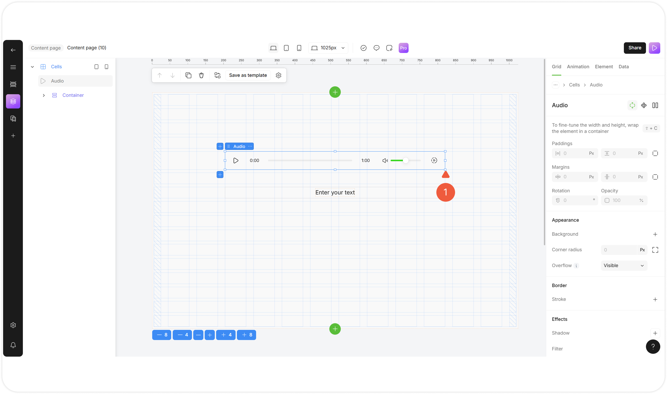
Select a unit to position it.

1
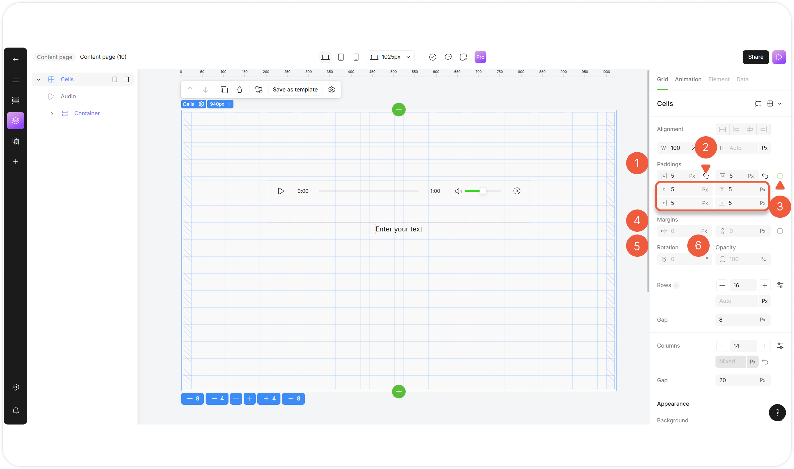
Paddings
Specify equal paddings for top / bottom and left / right sides in pixels.
Padding is the space inside an unit, between its content and its border.
! Use the Show box model hotkey to highlight the unit properties.
2
Reset / set default
Click Set default icon to reset the paddings settings.
3
Detailed paddings settings
Click the Individual paddings icon and specify values for each padding in pixels.
4
Margins
Specify margins in pixels.
Margin is the space outside the border, separating the unit from other units on the page.
Сonfigured in the same way as paddings.
! Use the Show box model hotkey to highlight the unit properties.
5
Rotation
Specify rotation value of the unit in degrees (0-360°).
! Set rotation last to avoid conflict with other settings.
6
Opacity
Specify transparency value in percentages from 0% (invisible) to 100% (fully visible).
Positioning a Unit in a Cells Layout
Select a unit in the Cells layout to position it.

1
Change unit size
Place your cursor over the border of the unit and stretch it.
Positioning a Unit in a Container Layout
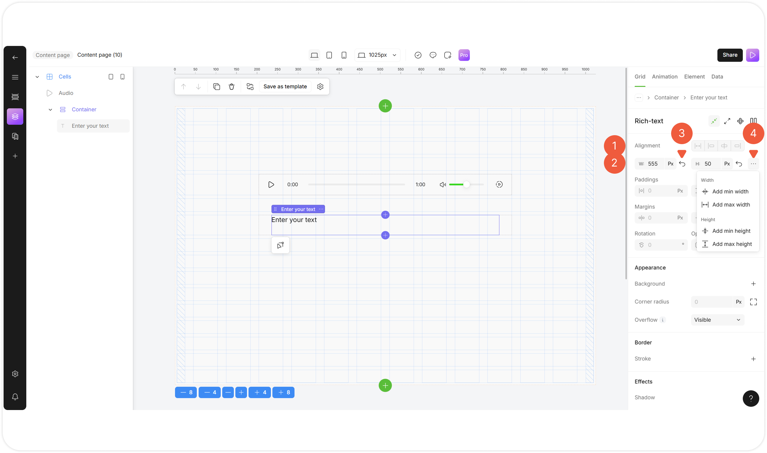
Select a unit wrapped in the Container layout to position it.

1
Alignment
Select the unit alignment relative to a parent unit.
2
Change unit size
Specify unit dimensions at the Width / Height fields in pixels or as a percentage of the parent unit size.
3
Reset / set default
Click the Auto icon to set the unit size automatically.
4
Size limitations
Click the … icon to add unit limitations:
Min. Width: specify the minimum width to which the container can shrink;
Max. Width: specify the maximum width to which the container can expand;
Min. Height: specify the minimum height to which the container can shrink;
Max. Height: specify the maximum height to which the container can expand.
Positioning a Unit in an Absolute Layout
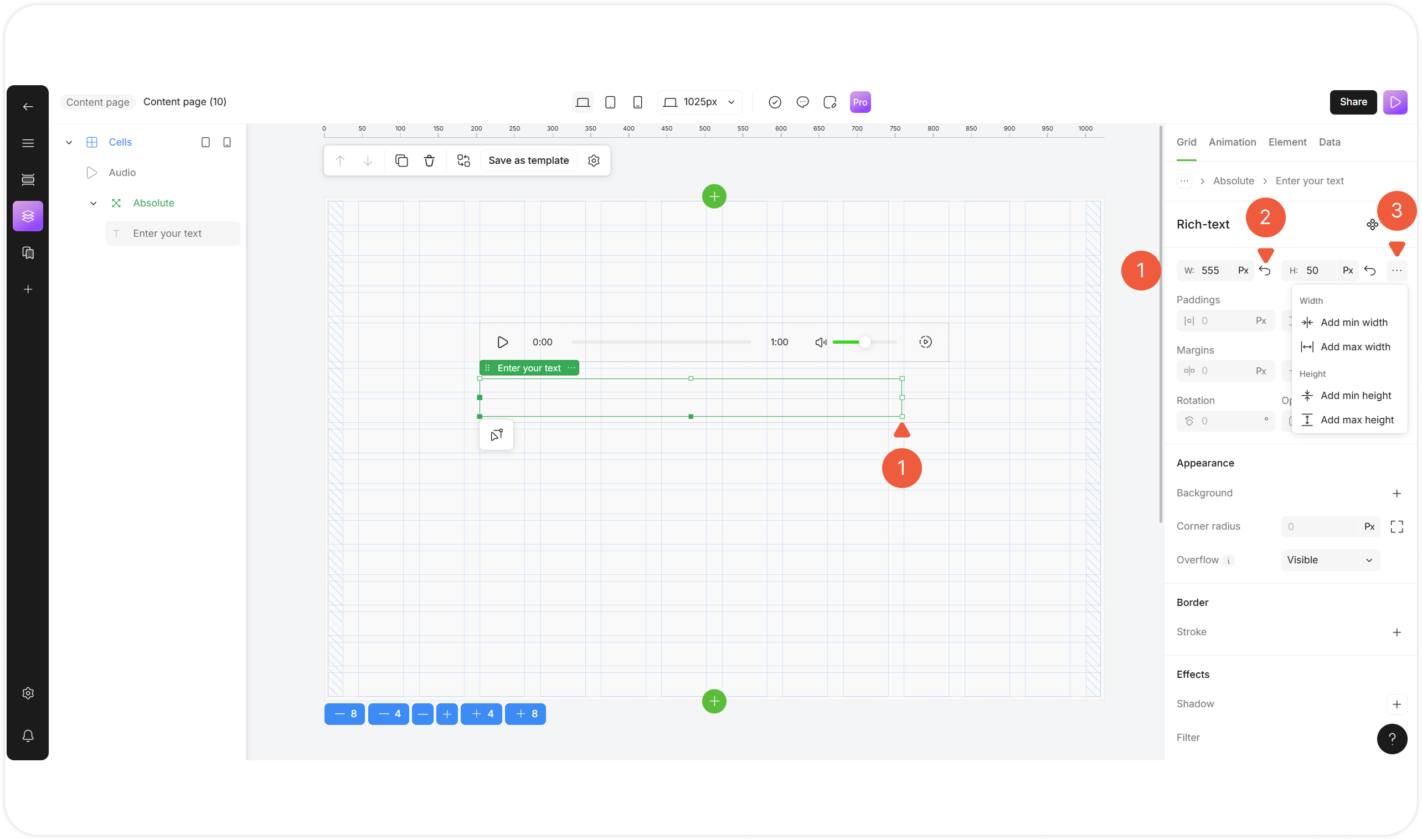
Select a unit wrapped in the Absolute layout to position it.

1
Change unit size
Place your cursor over the border of the unit and stretch it.
Specify unit dimensions at the Width / Height fields in pixels or as a percentage of the parent unit size.
2
Reset / set default
Click the Auto icon to set the unit size automatically.
3
Size limitations
Click the … icon to add unit limitations:
Min. Width: specify the minimum width to which the container can shrink;
Max. Width: specify the maximum width to which the container can expand;
Min. Height: specify the minimum height to which the container can shrink;
Max. Height: specify the maximum height to which the container can expand.
Style a Unit
Select an element to set its style.
Customize Unit Appearance

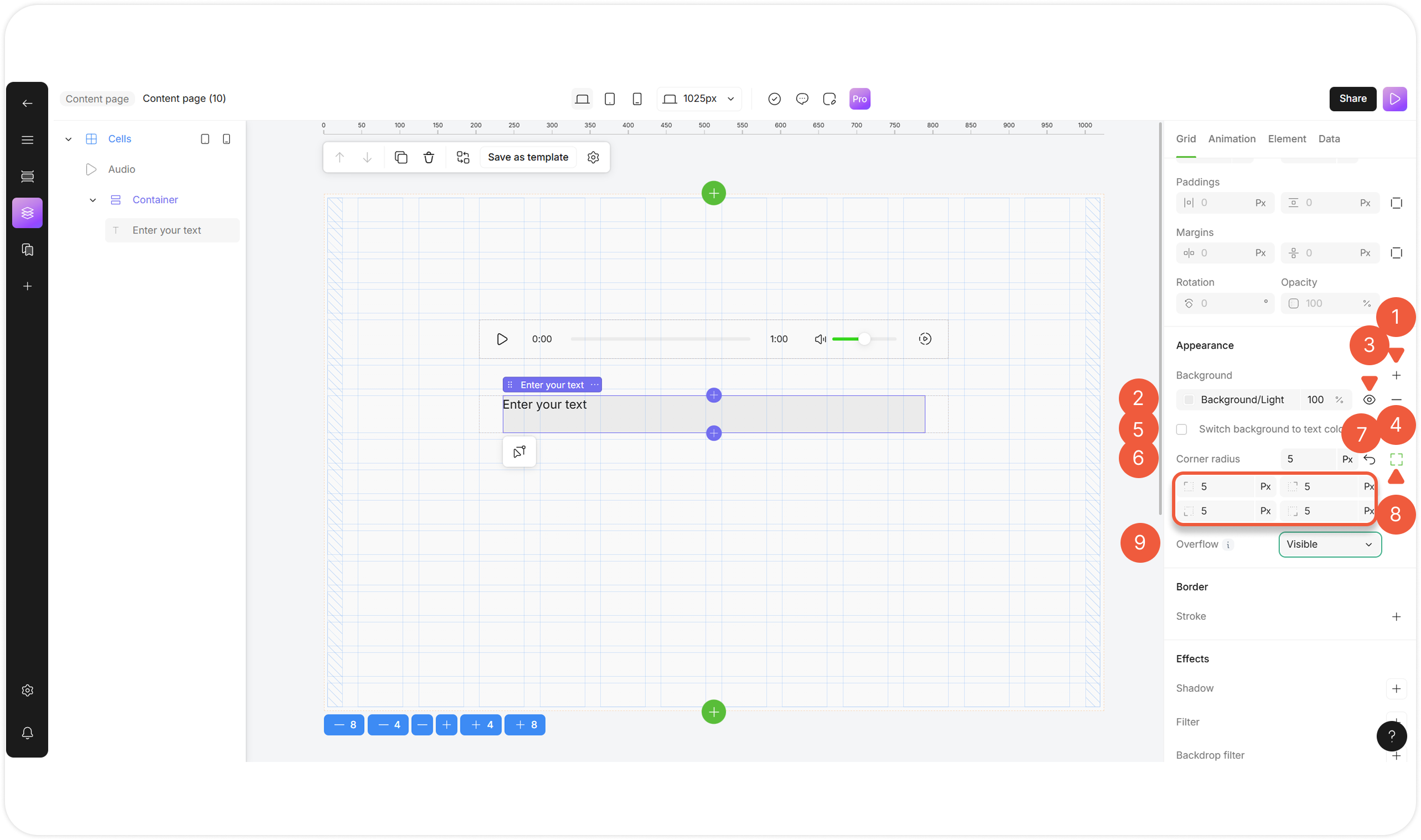
1
Add background
Click the Add background icon to add up to 10 background layers, including:
Solid colors;
Gradients;
Multiple layers.
2
Select background color
Click the field to select the background color and its intensity by using a hex color code or selecting a shade from the palette or Branding color list.
3
Hide / show hidden background color
Click the hide icon to hide / show the background.
4
Remove background
Click the remove icon to delete the background.
5
Switch background to text color
Select the checkbox to apply the background as a text fill (gradient text effect).
! Enables on text elements.
6
Corner radius
Specify the same corner radius for all corners in pixels or as a percentage of the parent unit size.
7
Reset borner radius
Click the Set default icon to reset corner radius value.
8
Add radius for individual corners
Click the Individual corner radius icon and specify values for each corner in degrees.
9
Overflow
Select an overflow option from the drop-down menu:
Visible: Extends content beyond the container's boundaries;
Hidden: Clipped content at the boundaries;
Scroll: Adds scrollbars regardless of the content;
Auto: Shows scrollbars only when needed.
Customize Unit Border

1
Add stroke (border)
Click the Add stroke icon to add a unit border:
Solid colors;
Gradients;
Images;
Multiple layers.
Сonfigured in the same way as background.
2
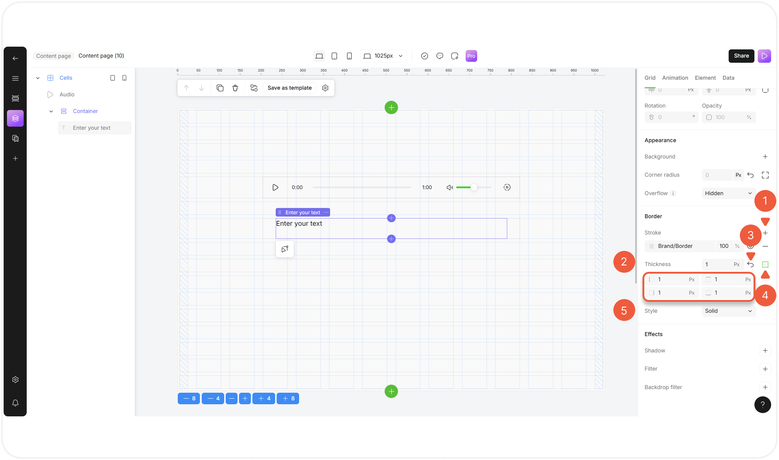
Thickness
Specify equal border width for all sides in pixels.
3
Reset thickness
Click the Set default icon to reset the thickness value.
4
Add Thickness for individual borders
Click the icon to display the fields for the individual sides and enter the borders thickness for each.
5
Style
Choose a border line style from the drop-down menu:
Solid: Converts the border into a continuous line;
Dashed: Converts the border into a series of dashes;
Dotted: Converts the border into a series of dots;
Double: Converts the border into two parallel lines.
Customize Unit Effects

1
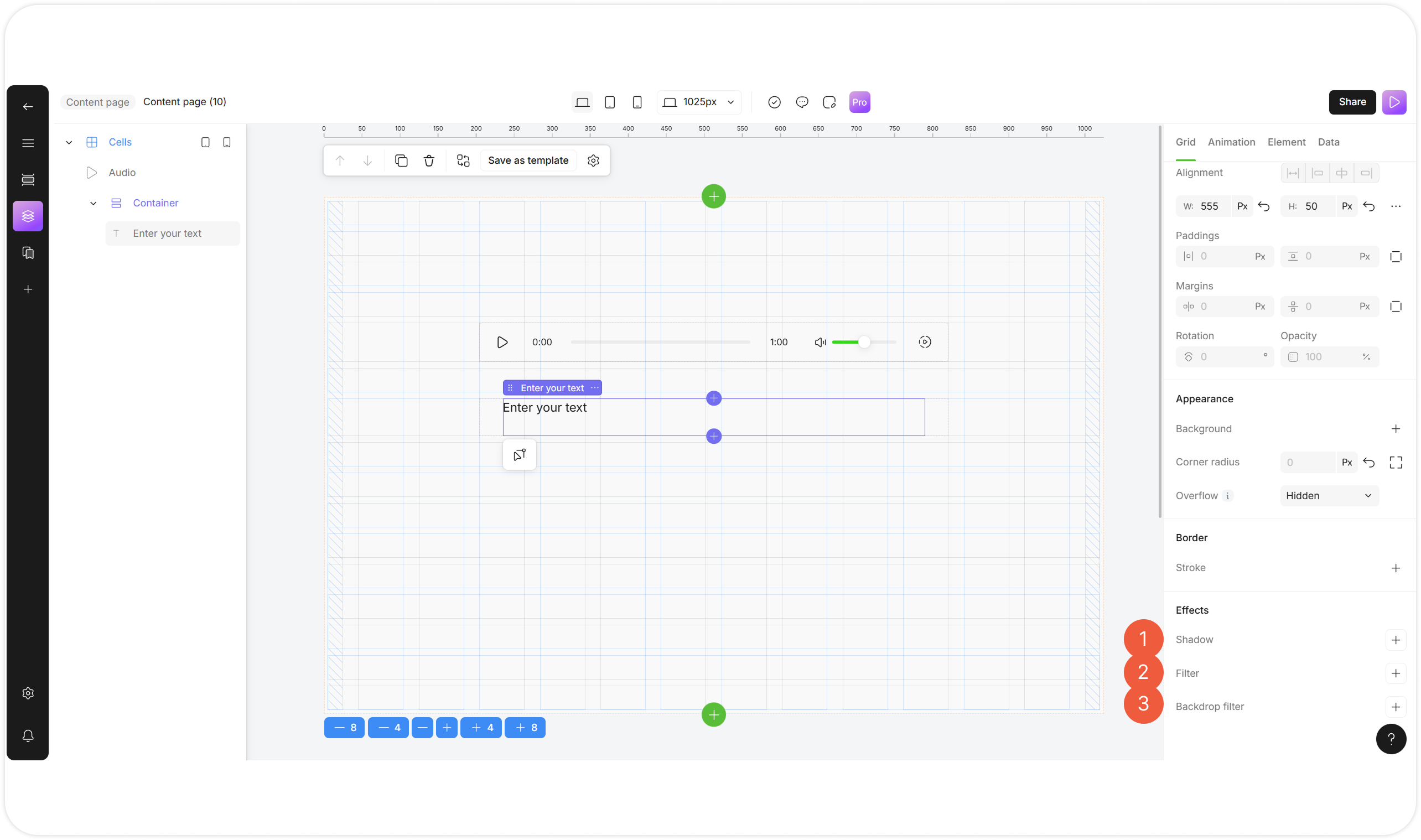
Shadow
Click + to add shadow to a to unit:
Shadow type: Select Soft, Regular, Retro for personalization; Select None to reset the shadow settings;
Shadow color: Select the shadow color and its intensity by using a hex color code or selecting a shade from the palette or Branding color list;
Shadow size: Adjust the filter values using the slider.
2
Filter
Click + to add one or multiple visual filters to unit content:
Blur: Softens the content, making edges less sharp;
Brightness: Makes the content lighter or darker;.
Contrast: Adjusts the difference between light and dark areas;
Saturate: Changes the intensity of colors;
Invert: Flips colors to their opposite (like a photo negative);
Hue Rotate: Shifts colors around the color wheel;
Sepia: Applies a warm, brownish, vintage tone. Adjust the filter values using the slider.
3
Backdrop filter
Click + to add one or multiple visual filters to the area behind the unit.
Сonfigured in the same way as filters.
! Useful for glass-morphing effects.
Last updated